Tencent Healthcare E-drug
Tencent Healthcare E-drug
A one-stop, patient-centered platform offering value-added medication services.
A one-stop, patient-centered platform offering value-added medication services.
About
About
Tencent Healthcare E-drug enables pharmaceutical and medical device companies to effectively reach and engage targeted patients, build private-domain operations, and drive digital brand marketing.
At the same time, it provides users with drug information, medication management, and educational resources to enhance their overall experience and understanding.
*This app targets the Chinese market and is translated for interpretation purposes.
Role
Role
Research
Product manager
Research
Product manager
Timeline
Timeline
Jun. - Aug, 2024
Jun. - Aug, 2024
Team
Team
3 Designers
1 Product manager
Engineers
3 Designers
1 Product manager
Engineers
Tool
Tool
Figma
Figma
Pain points
Pain points
Pain points
Pharmaceutical companies, despite having medical experts and strong professional teams, often struggle to provide direct support to their end users—patients who urgently need guidance and assistance with their medications.
Pharmaceutical companies, despite having medical experts and strong professional teams, often struggle to provide direct support to their end users—patients who urgently need guidance and assistance with their medications.
Patients
Scattered drug information
No medication guidance
Pharmaceutical and medical device companies
High-quality services fail to effectively serve customers.
Solutions
Solutions
Solutions
Tencent Healthcare E-drug serves as a bridge, delivering trusted medical knowledge and services from pharmaceutical companies to patients with professional support.
Patients receive
Trusted, easy-to-digest educational content on illnesses and drug usage.
Integrated services for medication usage, inquiries, and purchases.
A unified platform combining healthcare services and medication management.
Pharmaceutical and medical device companies can
Strengthen user awareness and enhance brand image.
Understand patient concerns to provide tailored services.
Improve patient adherence and establish a closed-loop medication purchase journey.
My contribution
My contribution
My contribution
Achievements:
I boosted user engagement and drove higher page views on the medication page.
I streamlined the user workflow and developed three feature solutions to enable patients to receive family support when needed.
Collaborating closely with product managers, engineers, BI teams, and designers, I investigated the causes of the decline. Additionally, I conducted stakeholder interviews and user research focused on accessibility needs, which informed the solutions.
The redesigned medication page successfully launched in September 2024.
I focused on redesigning the medication page to improve user engagement and led the development of accessibility features to support elderly users.
I led a second redesign of the medication page to improve engagement and increase page views.
I streamlined the user workflow and developed three accessibility feature solutions to address diverse user needs.
Collaborating closely with product managers, engineers, BI teams, and designers, I investigated the causes of the decline. Additionally, I conducted stakeholder interviews and user research focused on accessibility needs, which informed the solutions.
The redesigned medication page successfully launched in September 2024.
👀 10%+
👀 10%+
👀 10%+
page engagement
page engagement
page engagement
🤳 8%+
🤳 8%+
🤳 8%+
User retention rate
User retention rate
User retention rate
Project 01 / medication page redesign
Project 01 / medication page redesign
Context
Context
Context
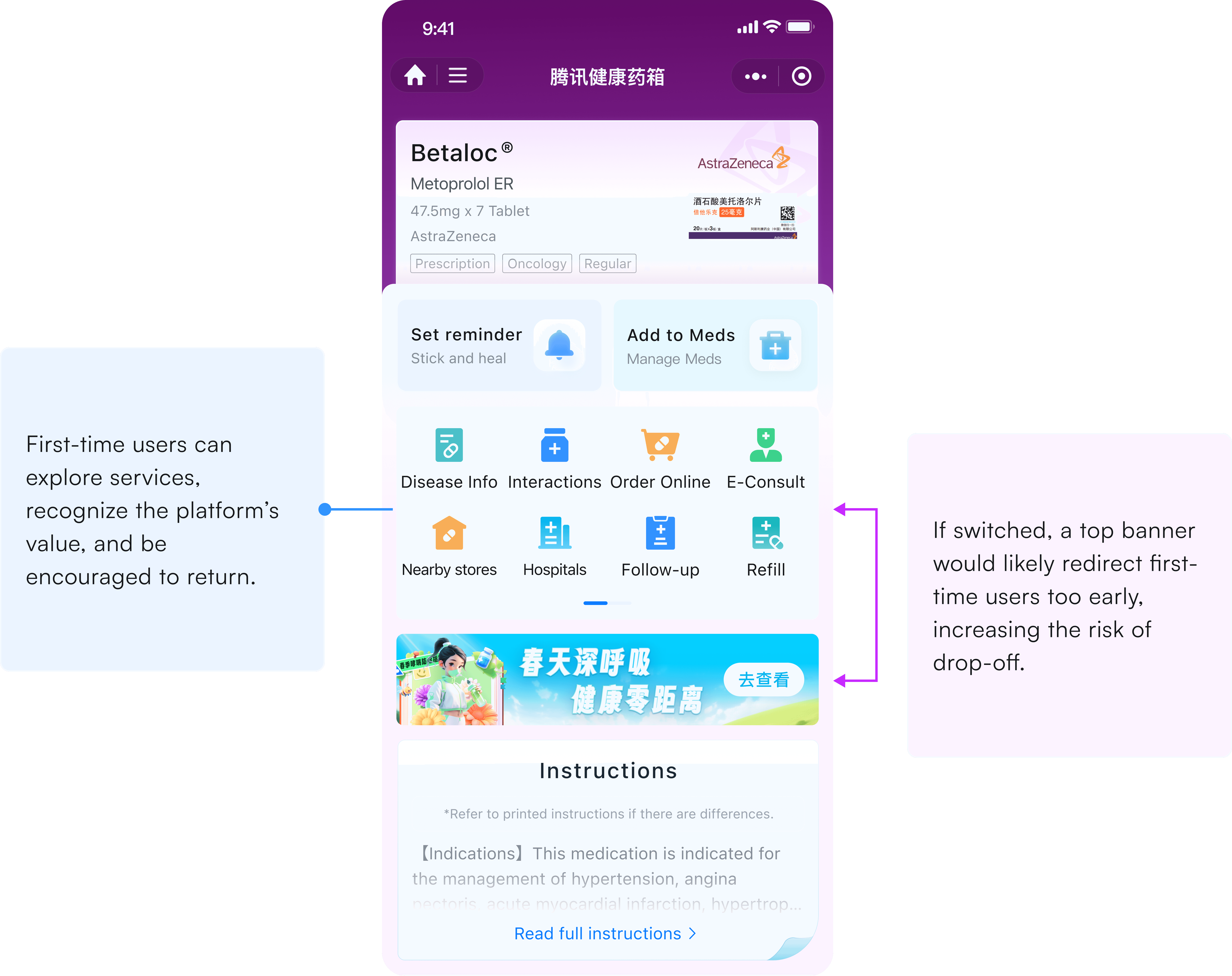
Capture first-time visitors and drive return visits by highlighting key services
Capture first-time visitors and drive return visits by highlighting key services
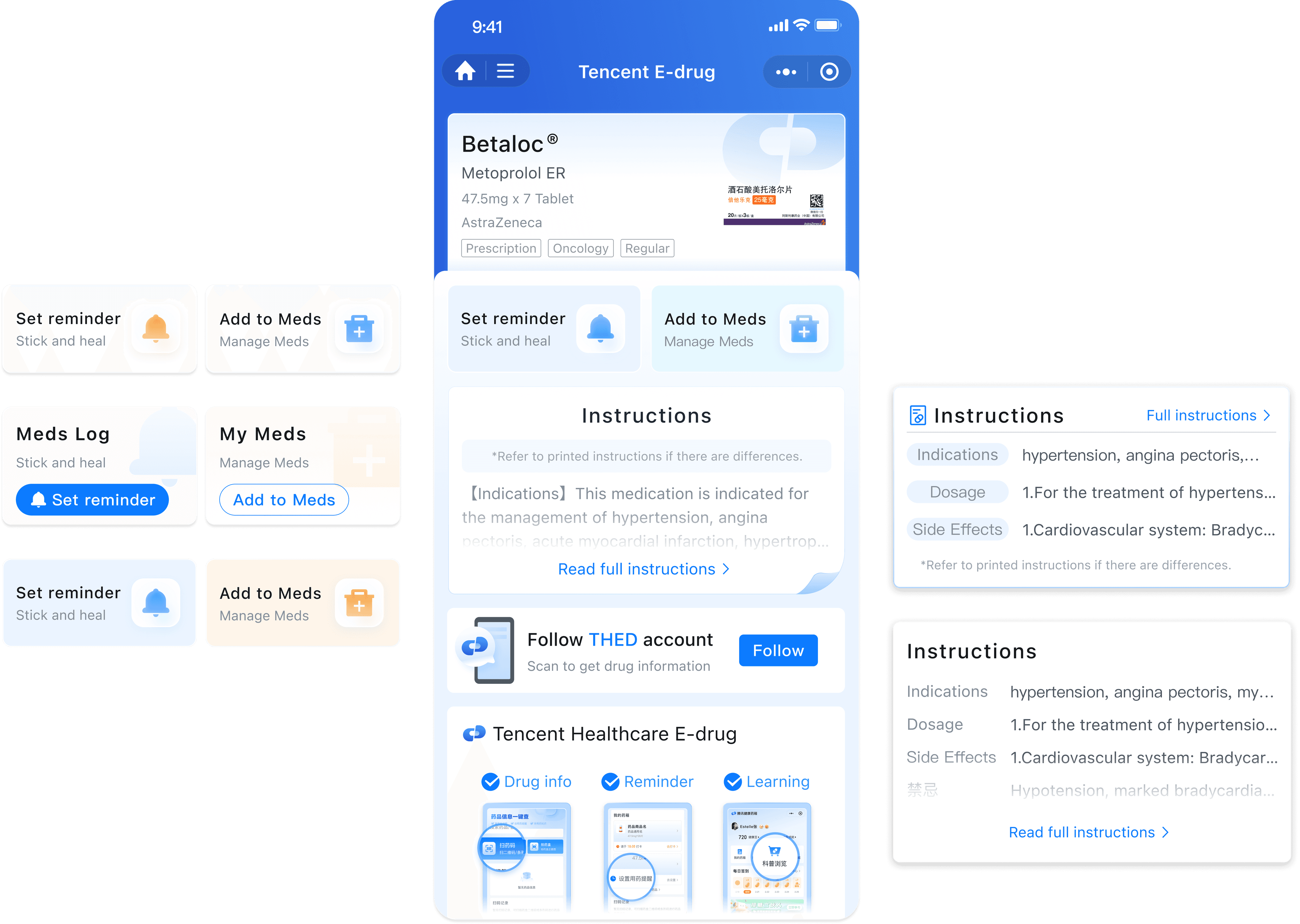
In China, each medication box includes a unique drug traceability code that records and tracks the drug’s production, distribution, and usage—ensuring safety and quality control. Users scan the code to enter our app.
In China, each medication box includes a unique drug traceability code that records and tracks the drug’s production, distribution, and usage—ensuring safety and quality control. Users scan the code to enter our app.
We aim to improve user retention by helping new users quickly discover the app’s value upon entry—such as medication reminders, medication management, and related drug information.
Our goal is to improve user retention by helping first-time visitors quickly discover the app’s value upon entry—such as medication reminders, medication management, and related drug information.

Users scan traceability code to
check the expiration date
verify authenticity
receive services and knowledge
Tencent highlight values and services
medication reminders
professional knowledge
medication support
Why redesign?
Why redesign?
Why redesign?
Drop in page engagement after a design update
Drop in page engagement after a design update
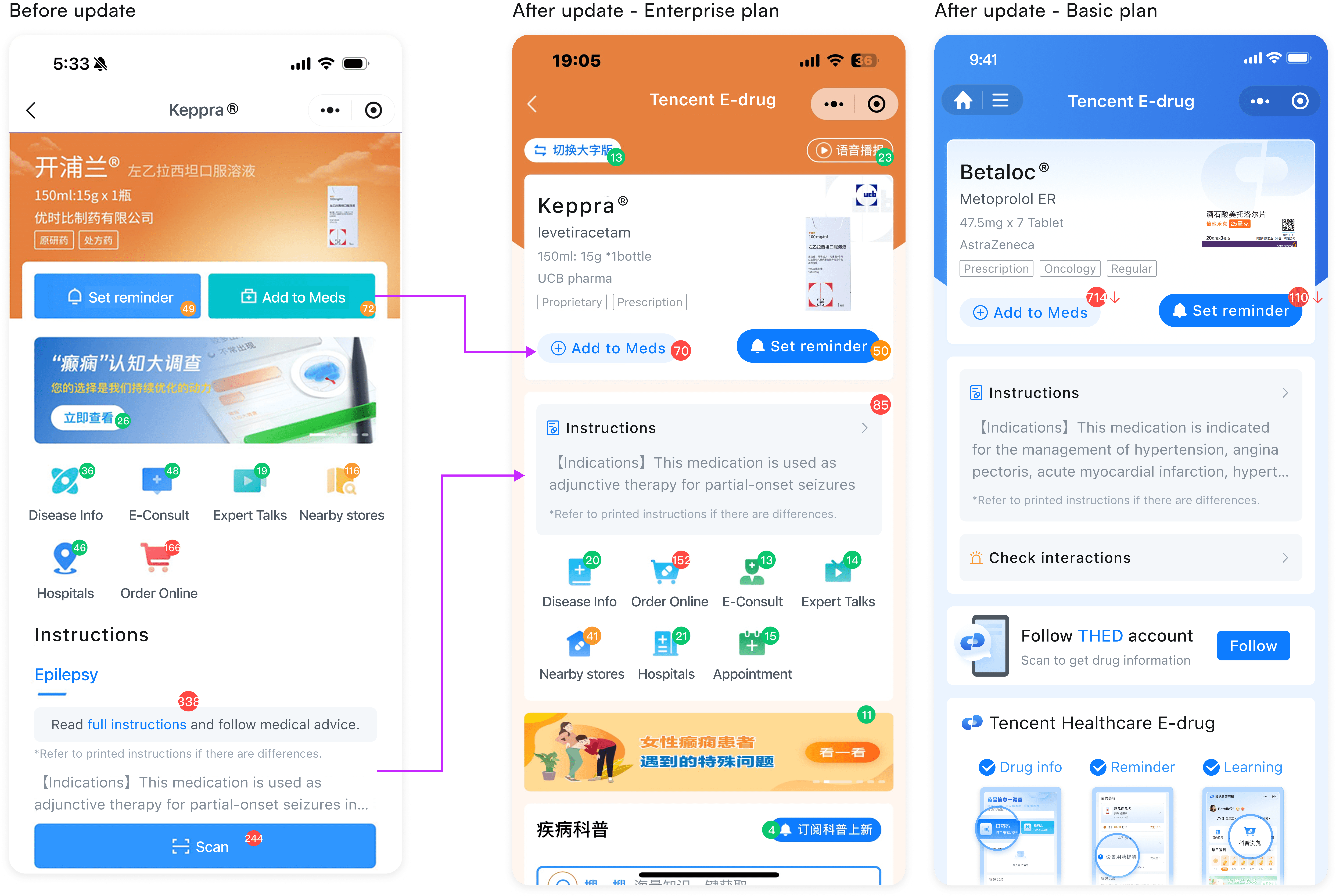
Before I joined, the team released a design update. However, it led to a decline in engagement on the medication page, with fewer page views and reduced user interaction. Users were less likely to engage with key elements or continue exploring the mini app after scanning the code.
Before I joined, the team released a design update. However, it led to a decline in engagement on the medication page, with fewer page views and reduced user interaction. Users were less likely to engage with key elements or continue exploring the mini app after scanning the code.
We want to
Understanding the problem
Understanding the problem
Understanding the problem
Use Business Intelligence to inform design decisions
Use Business Intelligence to inform design decisions
Due to medical privacy concerns, it was not ethically permissible to contact users directly, and we faced significant time and resource constraints that limited our ability to conduct user research.
Due to medical privacy concerns, it was not ethically permissible to contact users directly, and we faced significant time and resource constraints that limited our ability to conduct user research.
Although direct user recruitment was not possible, we leveraged BI data to observe and analyze user behavior within our app. I reached out to our BI team and analyzed user data before and after the design update to identify changes.
Although direct user recruitment was not possible, we leveraged BI data to observe and analyze user behavior within our app. I reached out to our BI team and analyzed user data before and after the design update to identify changes.
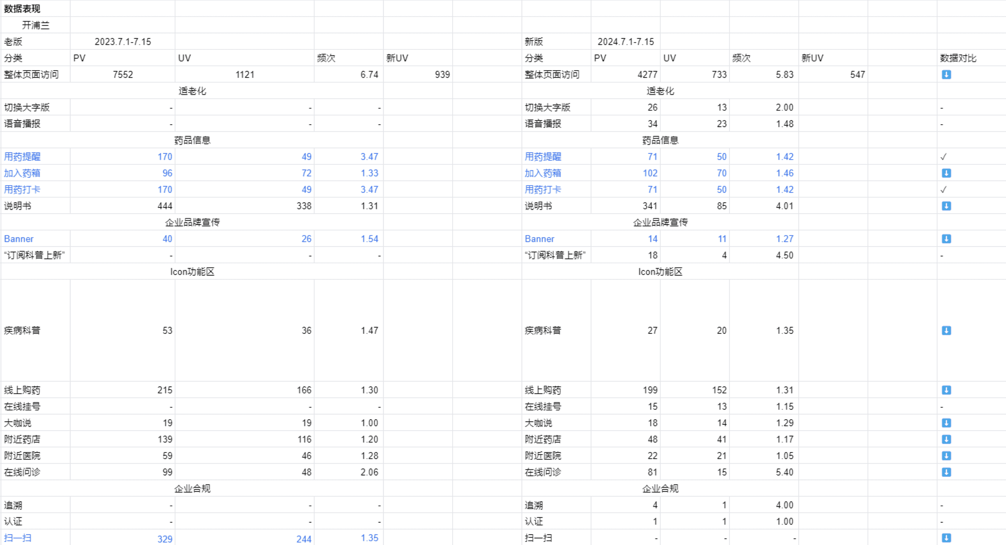
I observed a significant drop in unique visitors in specific areas—most notably the “Set Medication Reminder” and “Add to My Meds” buttons, as well as the medical instructions section. These two features are critical for delivering user value and driving repeat visits to our mini program. This decline was especially prominent in the Basic Version.
I observed a significant drop in unique visitors in specific areas—most notably the “Set Medication Reminder” and “Add to My Meds” buttons, as well as the medical instructions section. These two features are critical for delivering user value and driving repeat visits to our mini program. This decline was especially prominent in the Basic Version.
Meet with design teams to analyze the reasons
Meet with design teams to analyze the reasons
Leveraging my academic background in human behavior and design, I investigated the root causes and facilitated a team meeting to diagnose problems and align on actionable design requirements.
Leveraging my academic background in human behavior and design, I investigated the root causes and facilitated a team meeting to diagnose problems and align on actionable design requirements.
Problems is unclear guidance after update
Problems is unclear guidance after update
Unclear visual cues leave users unsure of where to click or what to do next
Unclear visual cues leave users unsure of where to click or what to do next
01 Buttons are too small and low contrast leads to poor visibility.
02 Visual cues are too weak to clearly indicate which areas are clickable.
03 The icons share similar colors, which reduces their distinguishability and can confuse users.
01 Buttons are too small and low contrast leads to poor visibility.
02 Visual cues are too weak to clearly indicate which areas are clickable.
03 The icons share similar colors, which reduces their distinguishability and can confuse users.
01 / Iterations
01 / Iterations
01 / Iterations
Design for key action buttons
Design for key action buttons
We conducted multiple rounds of design iterations for the “Set Medication Reminder” and “Add to My Meds” buttons. This page is the first landing screen users see after scanning the QR code on the medication box. Therefore, it's crucial to drive return visits through the “Set Medication Reminder” and “Add to My Meds” buttons.

We chose the final design solution because it:
✔️ Differentiate actionable areas from informational content
✔️ Easily draw user attention to encourage clicks
✔️ Visually harmonious with large interactive areas
We chose the final design solution because it:
✔️ Differentiate actionable areas from informational content
✔️ Easily draw user attention to encourage clicks
✔️ Visually harmonious with large interactive areas
Not selected designs

Plan A
Plan A
✖️ Buttons blend into the interface.
✖️ Buttons blend into the interface.
✖️ It's hard to tell that it's clickable.
✖️ It's hard to tell that it's clickable.
Plan B
Plan B
✖️ Too much text
✖️ Too much text
✖️ Overly large, take up valuable space
✖️ Overly large, take up valuable space
✖️ Distracts from key content
✖️ Distracts from key content
Plan C
Plan C
✖️ Appeared visually inconsistent with the background
✖️ Appeared visually inconsistent with the background
Negotiating with stakeholders
Negotiating with stakeholders
Negotiating with stakeholders
Navigating conflicting priorities in page design
Navigating conflicting priorities in page design
Clients have different perspectives on the design of enterprise medication pages. Many prioritize placing their banners at the top to maximize visibility.
Clients have different perspectives on the design of enterprise medication pages. Many prioritize placing their banners at the top to maximize visibility.


“We want to drive private-domain traffic and brand engagement, which is one of the most important features for us and the reason we chose your platform."
“We want to drive private-domain traffic and brand engagement, which is one of the most important features for us and the reason we chose your platform."
—Judy L., Client from a Pharmaceutical Company
Ultimately, we successfully persuaded the client to align with our approach.
Ultimately, we successfully persuaded the client to align with our approach.
02 / Iterations
02 / Iterations
02 / Iterations
Evaluating design solutions for medical instructions
Evaluating design solutions for medical instructions
We chose the final design solution because it:
✔️ Provides clear visual cues for clickability by mimicking the familiar feel of paper instructions
✔️ Features a well-balanced layout that effectively presents key information
✔️ Fulfills the legal requirement to display the first three lines of medication instructions
Not selected designs
Not selected designs
These plans were not selected because they either failed to meet compliance requirements or lacked clear visual cues indicating clickability.
These plans were not selected because they either failed to meet compliance requirements or lacked clear visual cues indicating clickability.
Reflection
Reflection
Reflection
What did I learn?
What did I learn?
01
01
Solving the right problems
Solving the right problems
Start by clearly identifying the problem the product feature is meant to solve—who it serves, and what specific user needs or scenarios it addresses. Once the overall direction is set, focus on refining the details and considering how the feature will perform across different real-world use cases.
Changing habits is hard. But solid psychological theories and best practices can become powerful tools to help our designs support users on their journey—making progress feel easier and more achievable.
I love gamification! Gamification acts as a form of reward, boosting motivation and increasing user engagement. It makes reaching goals more fun and enjoyable.
User testing is essential. What we think users will do often differs from what they actually do. We need to listen, observe, and learn from real users to make our designs truly useful and meaningful.
02
02
Let data talk
Let data talk
Data helps us understand user behavior and make smart design choices—crucial when time and resources are limited.
Changing habits is hard. But solid psychological theories and best practices can become powerful tools to help our designs support users on their journey—making progress feel easier and more achievable.
I love gamification! Gamification acts as a form of reward, boosting motivation and increasing user engagement. It makes reaching goals more fun and enjoyable.
User testing is essential. What we think users will do often differs from what they actually do. We need to listen, observe, and learn from real users to make our designs truly useful and meaningful.
02
02
Balancing aesthetics and functionality
Balancing aesthetics and functionality
While aesthetics enhance the experience, clarity and usability must come first. Sometimes, sacrificing visual polish is essential to ensure our designs are truly functional for the people we serve.
Changing habits is hard. But solid psychological theories and best practices can become powerful tools to help our designs support users on their journey—making progress feel easier and more achievable.
I love gamification! Gamification acts as a form of reward, boosting motivation and increasing user engagement. It makes reaching goals more fun and enjoyable.
User testing is essential. What we think users will do often differs from what they actually do. We need to listen, observe, and learn from real users to make our designs truly useful and meaningful.
What would I do differently?
What would I do differently?
I wish I had more time to conduct A/B testing and user interviews to better understand how people interact with the product.
I wish I had more time to conduct A/B testing and user interviews to better understand how people interact with the product.